


MACD Indicator = Moving Average Convergence Divergence. This indicator helps the trader understand whether there is a new trend by calculating the moving average, whether it is bullish or bearish. After all, the biggest thing for us is to find out if there is a new trend because most of the profit is available from the market trend.
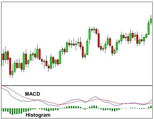 In MACD Indicator we usually notice three numbers in the settings.
- Number 1st calculates the fastest moving average.
- Number 2nd calculates the Slow Moving Average.
- Number 3rd is a Bar Chart (Histogram) that calculates the difference between Fast and Slow moving averages.
For example, if you see “12,26,9” in your MACD parameters (default settings) it means,
- 12 means, Fast Moving Average of the last 12 Candle.
- 26 would mean, Slow Moving Average of the last 26 Candle.
- 9 represents, the difference between Fast and Slow moving averages of the past 9 Bar. This creates a vertical line called Histogram. (Green color line mentioned above)
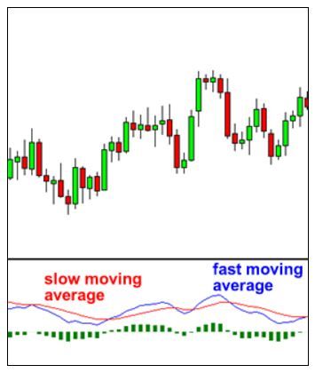
The histogram shows the difference between Fast and Slow moving averages, easily. If we look at the original chart, we can see that when the two moving averages are separated, the histogram becomes larger. This is called Divergence because of this, the Fast Moving Average tends to shift away from the Slow Moving Average.
Histogram tends to be smaller when the moving average moves closer to one another. This is called Convergence because Fast Moving Average moves closer to Slow Moving Average. This is basically the Moving Average Convergence Divergence.
How to Use the MACD Indicator?
Since there are two moving averages, at different speeds, the usual moving speed is faster than the slow-moving average compared to the market price. When a new trend is created in the market, the Faster line moves earlier and it crosses the Slower line. Whenever there is an indicator crossover, we can understand that a new trend is being created in the market.
 In this chart, we can see that the Fast Line is crossing down the Slow Line below it and it is signaling a Sell Trend.
Notice, where the blue line crosses the red line, the Histogram disappears.
This is because when two lines cross each other, its value becomes 0 and as it goes down, the Fast Line moves away from the Slow Line and the histogram becomes larger, indicating a stronger Sell trend.
See the example below,
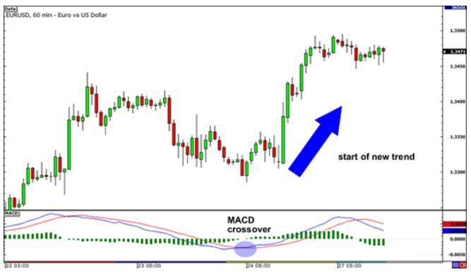 EURUSD H1 Chart: The Fast Line has crossed the Slow Line and because of this the Histogram has disappeared. This indicates that the probability of starting an uptrend is high. As we can see in the chart, EUR/USD has gone by trend. If you take buy positions, you may get a profit of at least 200 Pips. No problem, you learned today! We hope you can get more profit later.
If this article seems useful to your then please click the like button below. You can also share your valuable feedback or ask questions in the below comment section. Also, subscribe to our newsletter for trading-related updates.